Light
Dark
About
Contact
Home
Smartphone Gimbal
iSteady M Series
iSteady V Series
iSteady X Series
iSteady M7
iSteady M6
iSteady Mobile+
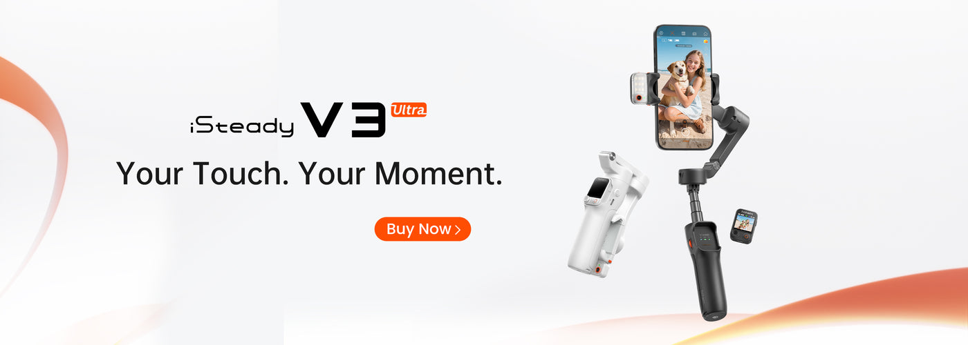
iSteady V3 Ultra
iSteady V3
iSteady V2s
iSteady X3 & X3 SE
iSteady XE
Professional
iSteady MT2
iSteady Pro 4
Blog
Support
Home
Smartphone Gimbal
Professional
Blog
Support